
A web application built for Cardinal Spirits that allows users to track sales and view sales analytics in a clear and informative way.

PROJECT TYPE
Sales Analytics
Website
TOOLS
Figma
Adobe Illustrator
Adobe XD
MY ROLE
UX Designer
UI Designer
Front-End Developer
TEAM
Eric Uhde
Andrew Laslo
Nick Leisure
Nikita Sahoo
TIME
May 2017 - October 2017
Cardinal Sales is a web application that was created for Cardinal Spirits, a distillery located in Bloomington, Indiana.
Stakeholders at Cardinal Spirits needed a way to track the sales made by the company, and they needed a clear way to see and understand the sales data in order to help them make decisions for the company’s products and business operations. Before developing the app, stakeholders were relying on spreadsheets to track sales data, and they found that spreadsheets were frustrating and arduous to use.
ABOUT CARDINAL SALES
In Brief

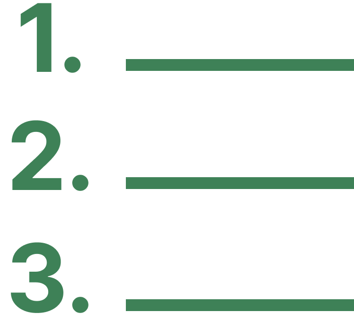
How might we help users understand and track sales data in a way that positively influences their business decisions?
Design Challenge
Solution
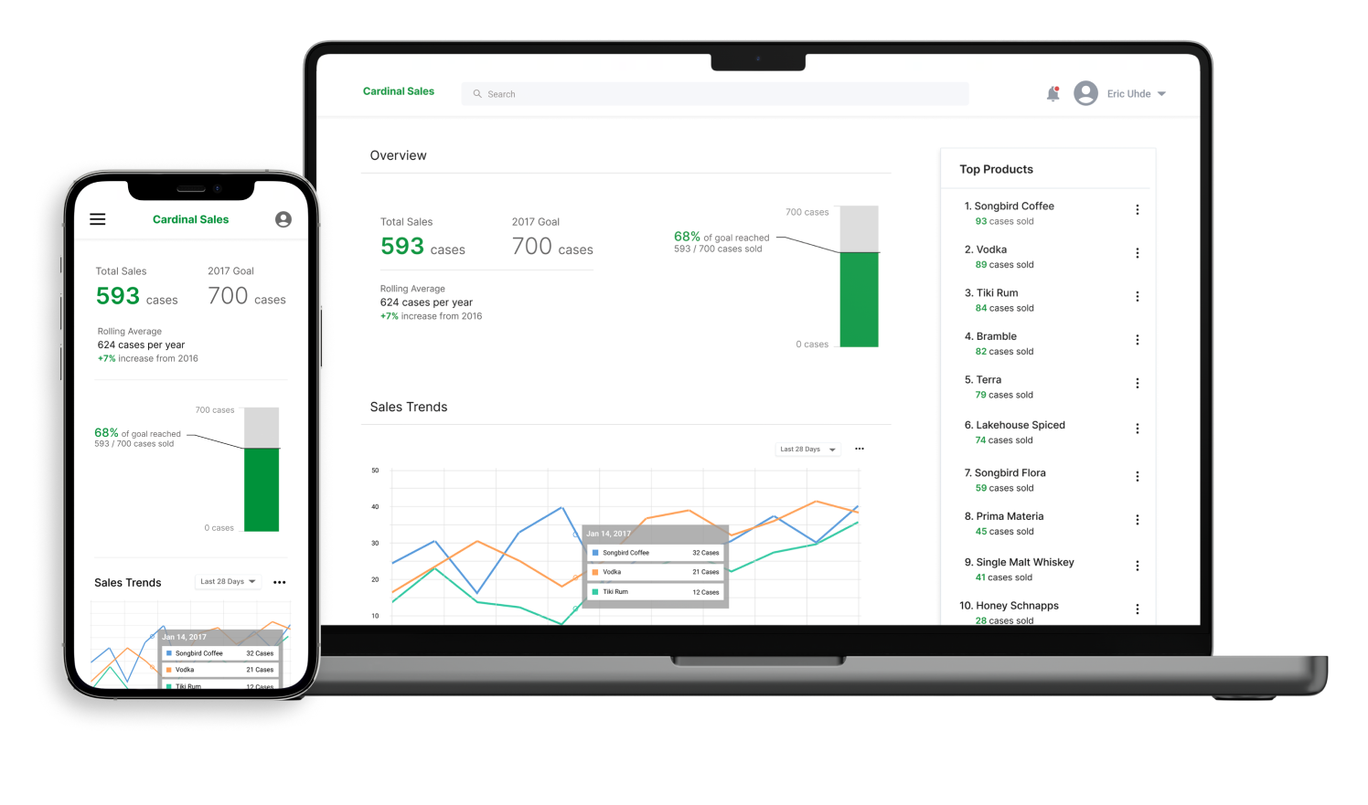
We designed Cardinal Sales, a web app that processes and presents sales data to the user in a comprehensive and informative way. The app provides an intuitive user experience that includes clear and detailed data visualization and customization options. It also enables users to quickly set sales goals and see how close they are to achieving those goals.
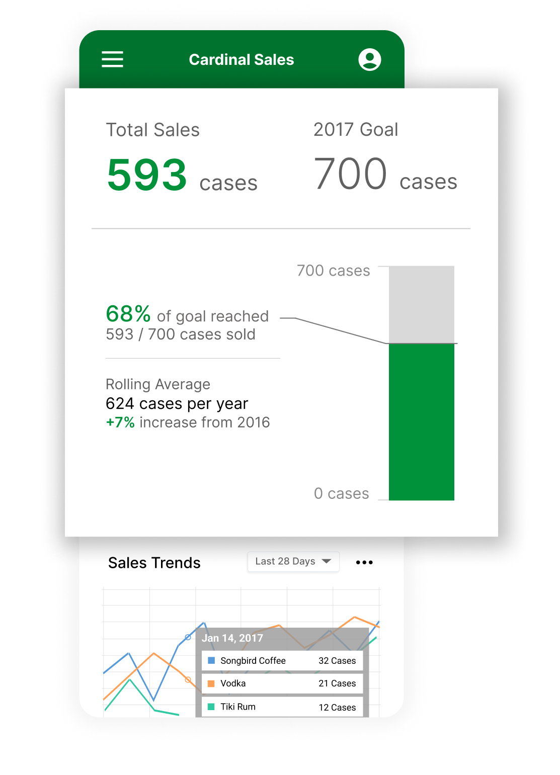
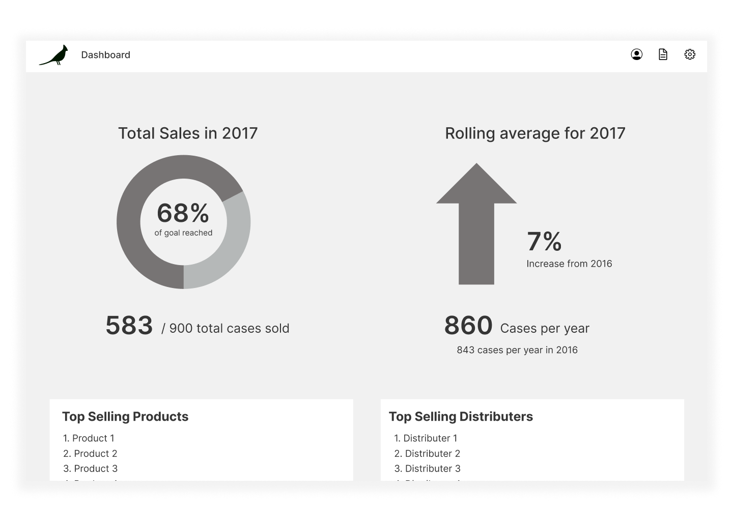
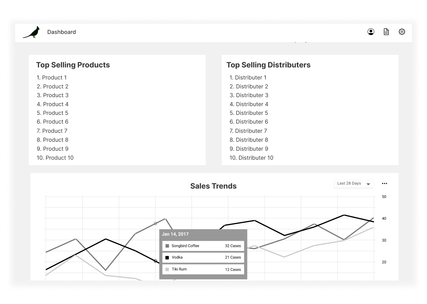
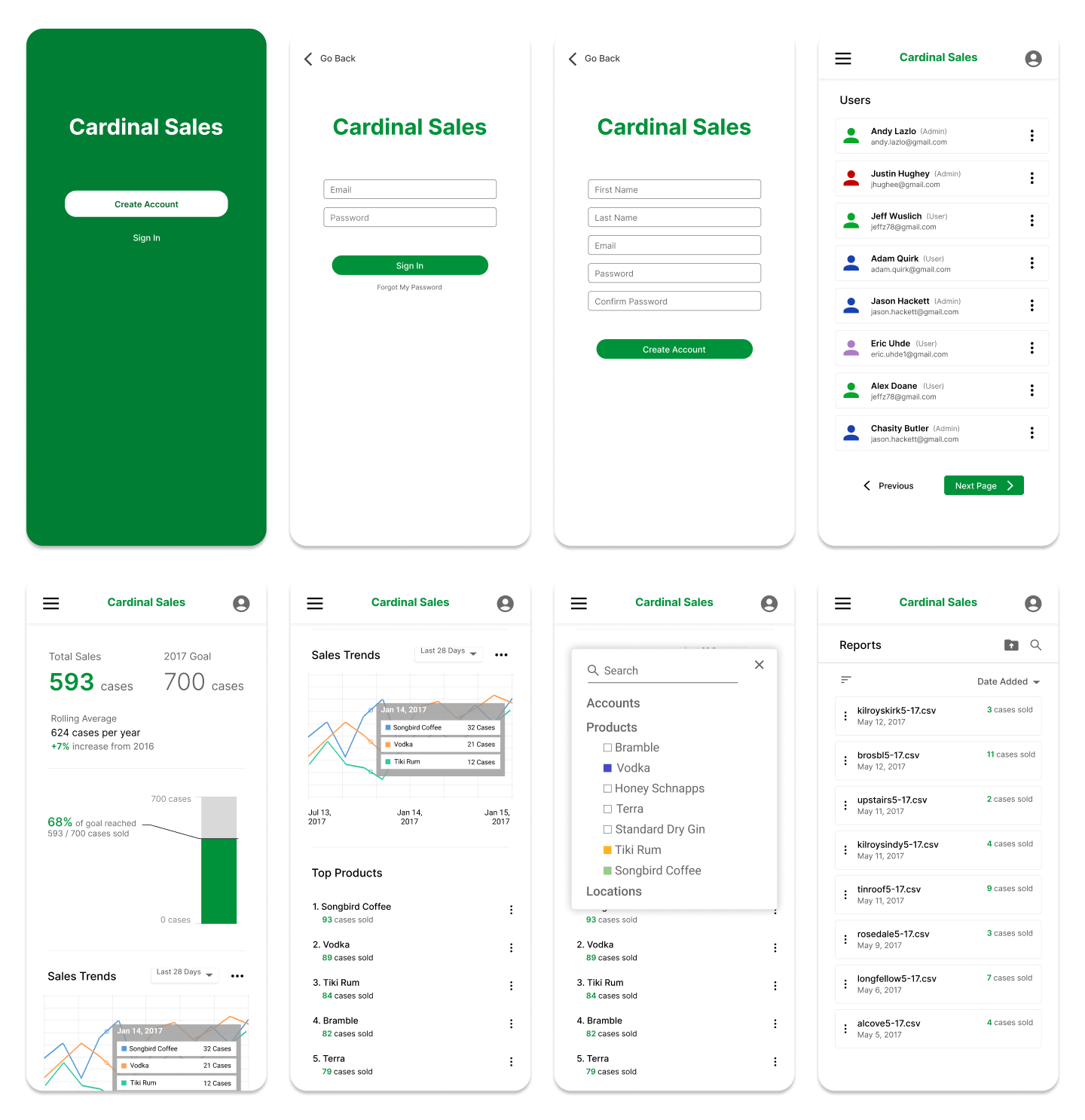
Quickly find important information with ease
With a quick glance, you can find principal sales information and have an understanding of where the company’s sales currently stand. See the total number of products sold, and set goals and track your progress towards them. You can also compare current sales with sales from the previous year by looking at the rolling average.
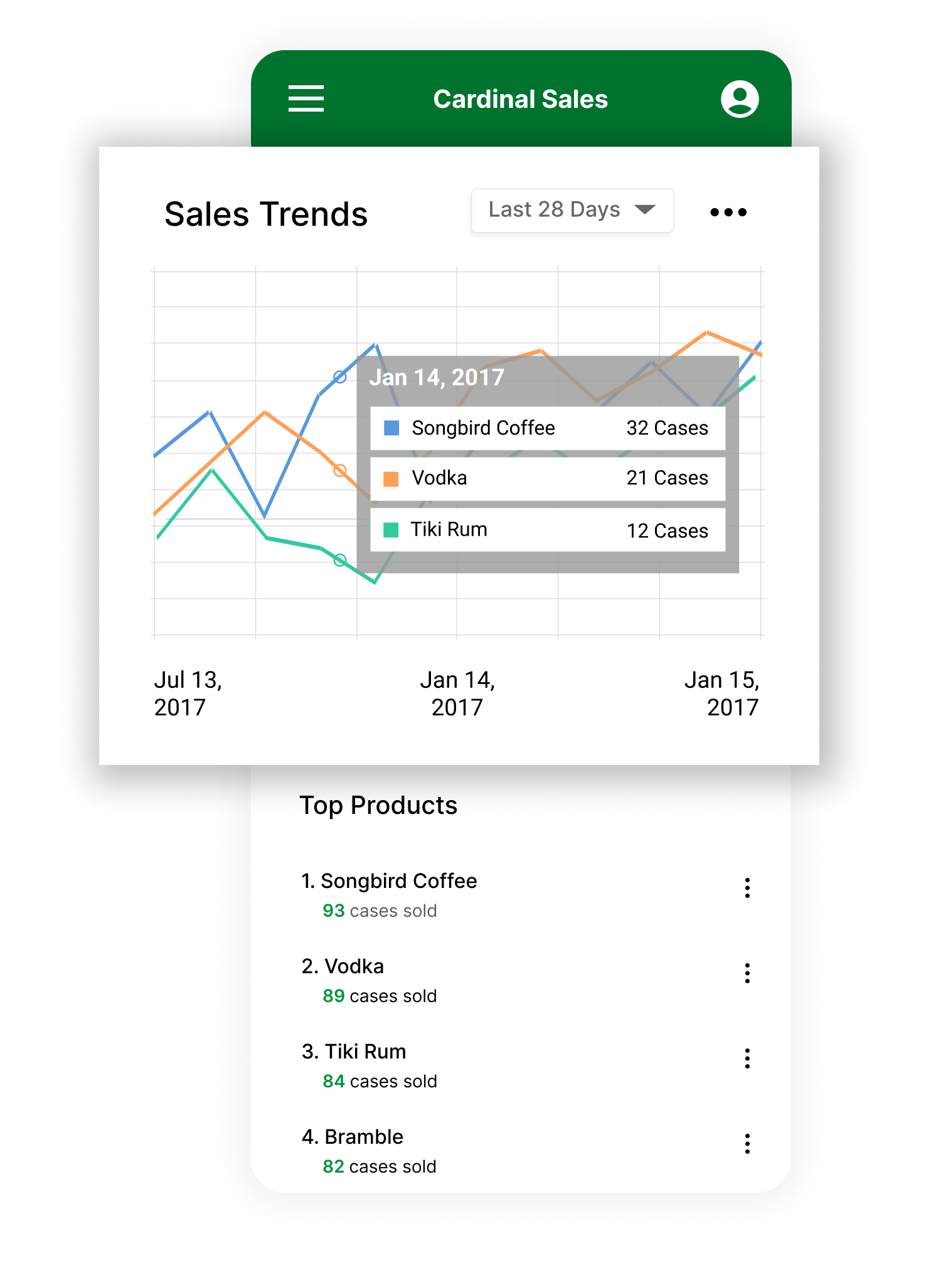
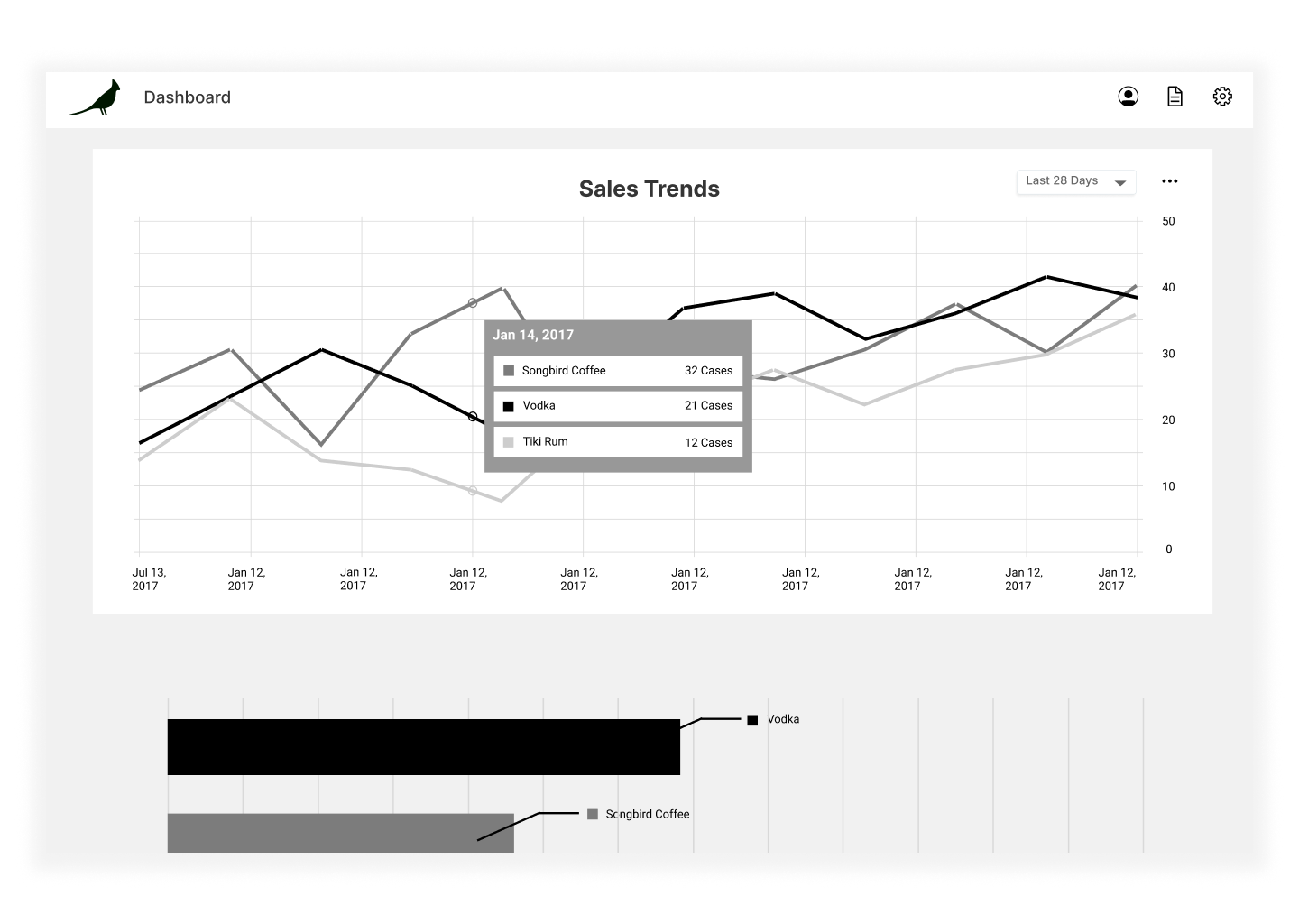
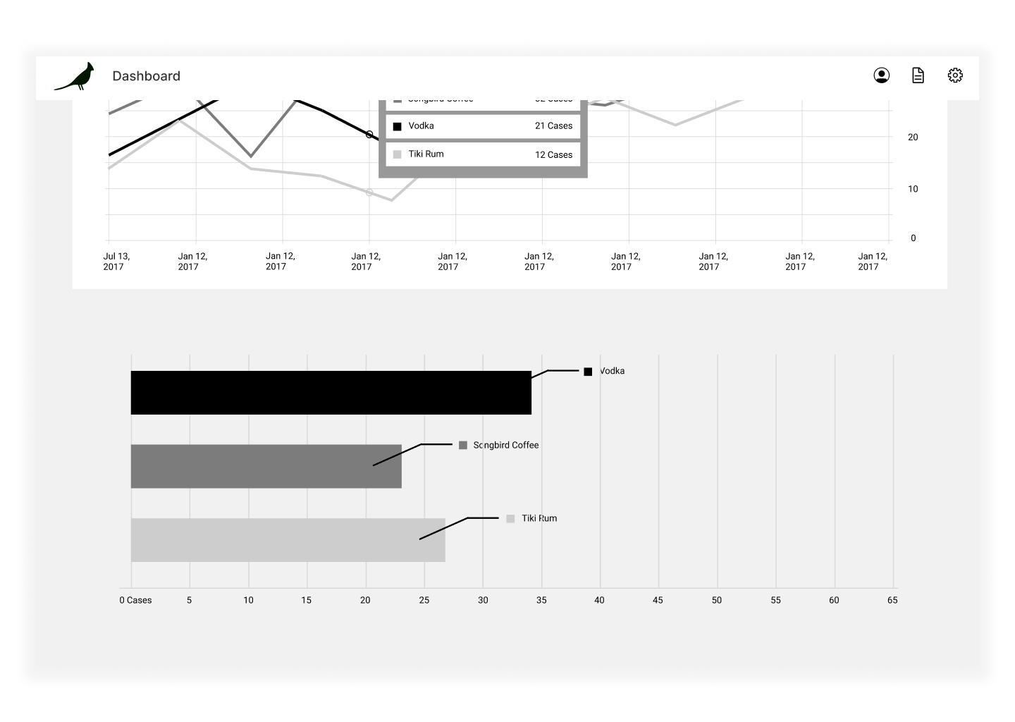
Track and compare product sales trends
The Sales Trends graph allows you to compare and analyze company sales over a given period of time. You can select which products, suppliers, and distributers are shown in the graph.
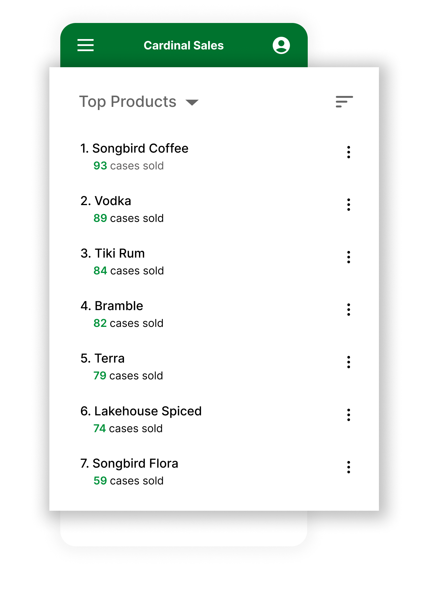
View top selling products and distributers
With a quick glance, you can find principal sales information and have an understanding of where the company’s sales currently stand. See the total number of products sold, and set goals and track your progress towards them. You can also compare current sales with sales from the previous year by looking at the rolling average.

PHASE 1
RESEARCH
Interviews
Before diving into solutions, we conducted interviews with the stakeholders (the users) for a few different reasons. Most importantly, we wanted to make sure our team fully understood the users’ current system for tracking their sales, and what the users like and dislike about it. We also wanted to develop an understanding of what the users were looking for in a sales app.
Insights
Users want to see how product sales are changing over time.
It’s important for users to be able to quickly find the sales information they need without feeling overwhelmed. (“I’d like to have an idea of where our total sales are currently standing without having to dig through a bunch of data.”)
Users want to compare sales between different products, suppliers, and distributers
PHASE 2
DESIGN
Ideation
With our research findings in mind, our team brainstormed solutions together. We attempted to come up with as many ideas as possible without considering feasibility at this stage. We then went through the ideas and discussed which of them would best support the main purpose of the application: How can we help users understand and track sales data so they can make better business decisions?
After our team completed discussing our ideas and distilling them down, I organized them into the following roadmap:
I use roadmaps because they tend to help me and my teammates keep our ideas organized, and they serve as reminder of what the main purpose of the app is. Whenever I get stuck or feel a bit overwhelmed by a project, I’ve found that reminding myself of the project’s main purpose can provide a bit of clarity and guidance.
We settled on the following core functionalities:
Use a search function to quickly find the sales data for a product, supplier, or distributer
Track sales trends for total sales, products, and distributers using a line graph
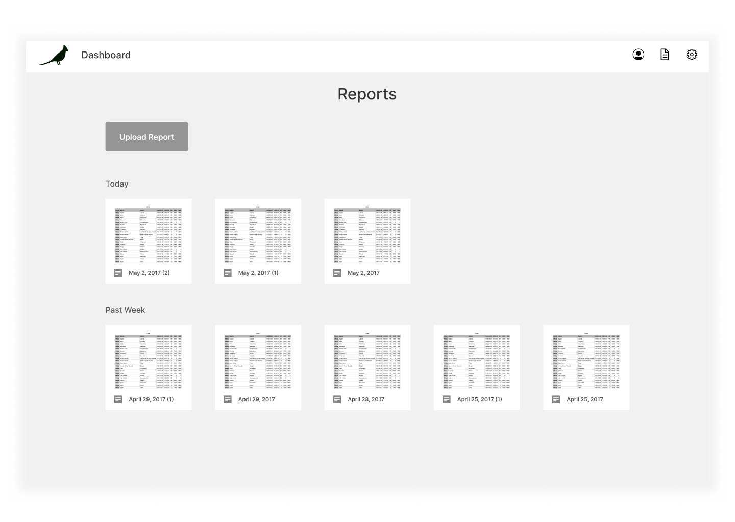
Allow users to upload CSV files, and automatically update the app to reflect the new sales data
Provide lists of top products, distributers, and their respective number of total cases sold for the current year

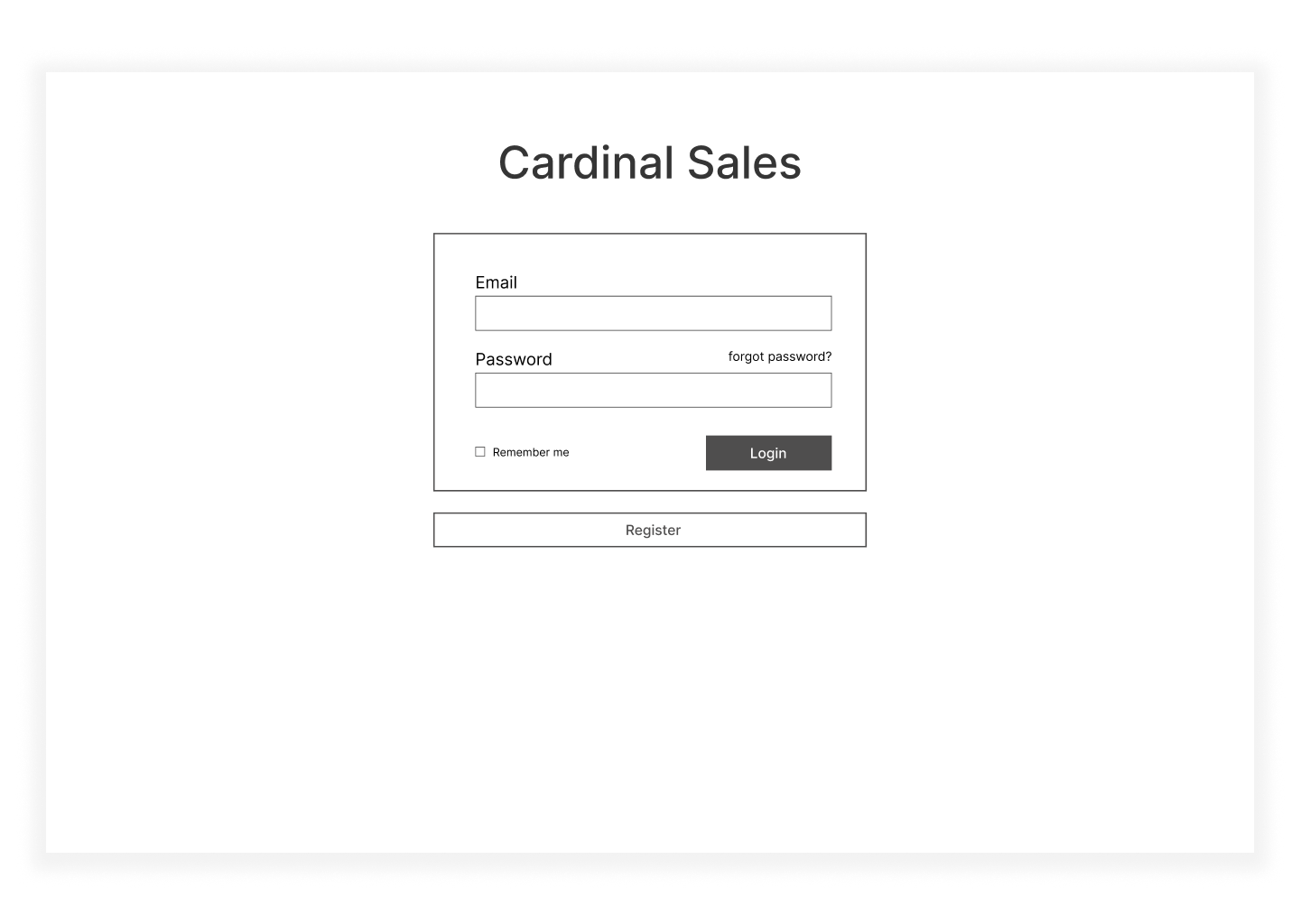
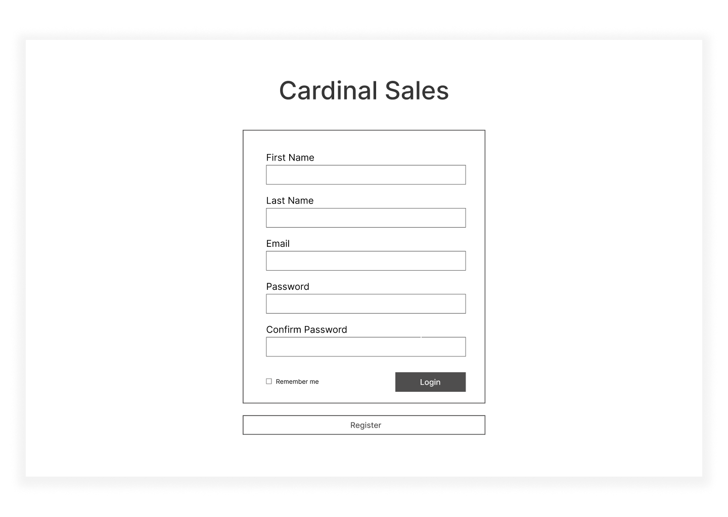
Sketches & Wireframes
Andy and I created the following wireframes and brought a prototype to the users for feedback.
User Feedback & Revised Design Goals
All users liked the Sales Trends graph, and agreed that it would be the most used and most important feature of the application. This was reassuring for us, since this function was our primary focus.
Informing and Empowering our Users
Some of the users felt that the home page was overwhelming or cluttered. We also noticed that the users prioritized the Sales Trends graph over everything. With this in mind, we decided to get rid of the geolocation graph and redesign the interface so that it’s more aligned and focused towards the Sales Graph.
High-Fidelity Design - Iteration 1
For the first iteration, our primary goal was to validate whether the design helps users track and compare sales trends, quickly view sales goals and progress, and make business decisions faster.
PHASE 2
Evaluation
User Testing Process
With the goals I had for this iteration in mind, I moderated user feedback sessions with 5 users with varying preferences towards sales data and data visualization methods, and different levels of familiarity with interacting with sales data. Here's a brief overview of the process:
Introduce the project goal.
Describe the scenario, set up the context, and let users use the app while thinking aloud.
Ask follow up questions and gather feedback.
Let users fill out a questionnaire. Thank them for participation.
Results
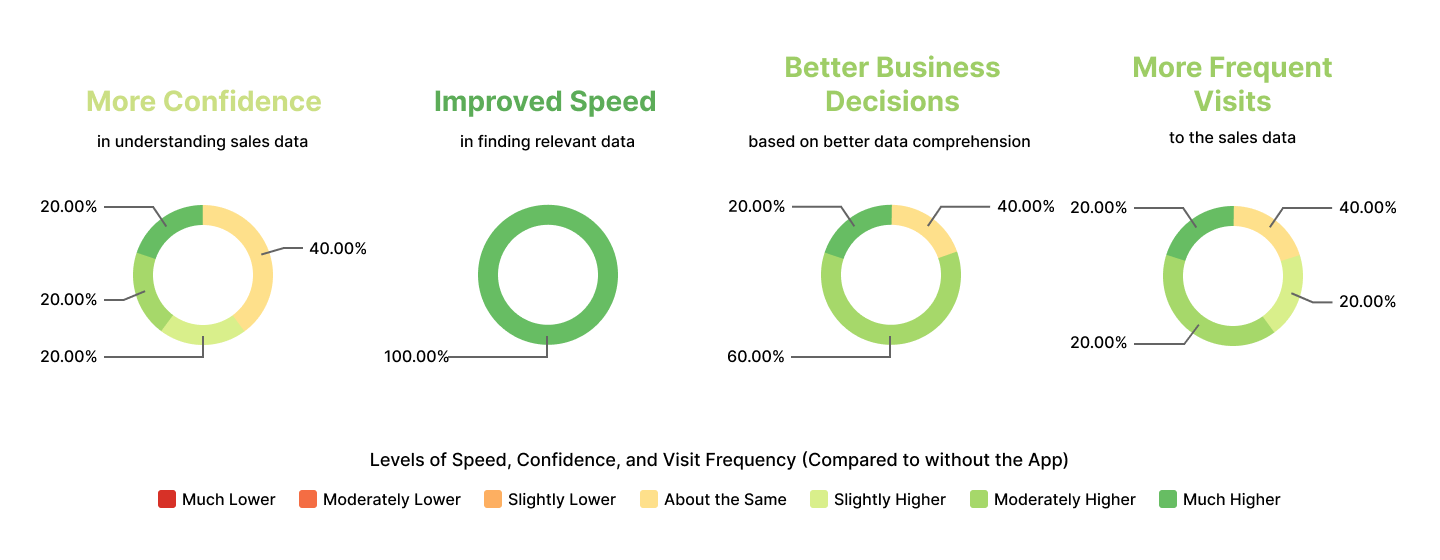
I was able to gather a lot of feedback on the prototype, from users with different time constraints, different preferences towards viewing sales data, and different familiarity levels with interacting with sales data. Here's a summary of how people rate their own confidence in understanding the sales trends data, their speed in finding the particular sales data they’re looking for, how frequently they will look at sales data compared to how frequently they do now, and their confidence in making business decisions based on their knowledge of the sales data from using the application.
Reflection
What I Learned
Designing this application helped me understand that in order to create a system that works, it’s important to start with a simple system that meets initial selection tools before improving it over time: “A complex system that works is invariably found to have evolved from a simple system that worked.”
We made the mistake of designing the application with a focus on having a lot of features and different kinds of data visualizations. After many iterations we continued to simplify and distill the app